Week of Kitchen Renovations: Extra Counter and Cabinet Space
I’m kicking off the new year with a full week of Kitchen Renovation updates. Our kitchen has been done since July and I’ve been slacking on posting the “after” pictures. So this week I’ll be featuring various aspects of our kitchen that we love. On Friday, I’ll be posting the back to back before and after pictures for the entire project (well for what’s done until now). Hubby and I still have a few minor things to finish, including some decorating and paint touch ups.
As I mentioned over the summer, we absolutely loved our kitchen designer (I made her some peanut butter brownies to show our appreciation). She really did come up with some creative ideas to increase our counter space and storage space in the kitchen. Since our budget couldn’t accommodate moving the sink or stove (moving gas or water lines can be very expensive in old buildings), we couldn’t change the layout very much.
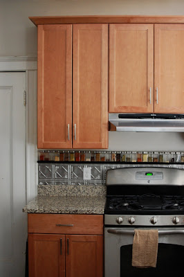
One thing we did to increase our cabinet space was to take advantage of our 108″ ceilings. We went with 42″ tall cabinets on the top. These are very tall cabinets (look how high above the door frame they go!) I’m a tall girl and I still have to use a little foot stool to reach the top shelf. Luckily, Hubby can reach without the step stool.
The single best thing we did to increase the counter space was to move the fridge into the dining area. This allowed us to have a counter over our radiator. It also allowed us to add another small cabinet where the fridge used to be. This was BY FAR the most creative idea our designer came up with. It’s actually quite funny because we had gone in to order our cabinets and she said she had one last idea. I was getting antsy to get the renovation started, I almost didn’t hear her out. I’m so glad I did. By moving the fridge from in front of the window, we also get a lot more sunlight through our gigantic double window. I was a little apprehensive that the fridge would seem out of place in the dining room, but you have to keep in mind that this is a very small space, so it all really just flow together as one large room and the fridge doesn’t look lost in there.
As yet another obstacle, we didn’t want to move the windows and we also didn’t want to cover them at all. So the counter that goes over the radiator is at a lower height. It sits at 30″ where normal counter height is 36″. You can see how low it is in the picture above. So it’s not very ergonomically friendly for Hubby or I to be cutting vegetables, but it’s a great space to put things, like cookies cooling, or plates waiting for dinner to be finished. It’s great because it allows us to keep the main working space to the left of the stove cleared off at all times.
As I mentioned, this also allowed us to have a small cabinet in the corner, increasing our cabinet space even more. AND, for even more storage, we use the space near the radiator to store serving plates and extra rolls of paper towels and toilet paper.
You might notice that the cabinet doors in front of the radiator look like an actual radiator cover. This is a project that Hubby and I did ourselves. Our designer ordered doors that would normally have glass in them. But instead of ordering glass to fill the doors with, we bought some metal mesh that is used in radiator cover construction. It’s carried in large 36×36″ sheets. Since they were a shiny metal, I took them outside and spray painted them with black matte spray paint. It took about 3 light coats on each side. Hubby then used wire cutters to cut the sheets down to the appropriate size.
To attach them to the doors, we were worried about the sharp edges, so I decided to just use hot glue and really goop it on there. As you can see, these sheets are not going anywhere and there’s no concern of catching your finger on a sharp metal edge. These doors allow the necessary level of ventilation for the radiator and look great in the kitchen.
Check out my Week of Kitchen Renovations here.




 I am Jen the Beantown Baker. Engineer by day and baking maven by night. Hubby serves as my #1 fan and official taste tester. We got hitched back in 2006. Barefoot. In the sand. With the waves crashing behind us. It was one of the best decisions we’ve ever made.








Wow, I can’t wait to see the completion! It’s also very smart that you made freezer meals…that really does save money and time! I hated when we reno our kitchen, we had to eat out for weeks…it got quite annoying to pick something up for dinner. We spent more money eating out vs. eating at home! Good luck with your kitchen reno, I bet it will be fantastic!
Wow, I’m impressed that you can do a food blog with that tiny amount of space. Good luck with the remodel!
How exciting, can’t wait to see the results! I hope everything goes smoothly!
And I thought I had a tiny kitchen! Congrats on the renovation!
Wow, I can’t believe the magic you created in that small kitchen, I am so excited for you. I can relate, my kitchen is smaller, but thankfully we are house hunting and kitchen is big on the priority list.
Great job preparing! That baby is packed!
I haven’t seen a radiator in forever! 🙂 Looking forward to seeing the new kitchen.
That is pretty impressive all those yummies that you’ve created with a limited amount of space.
~ingrid